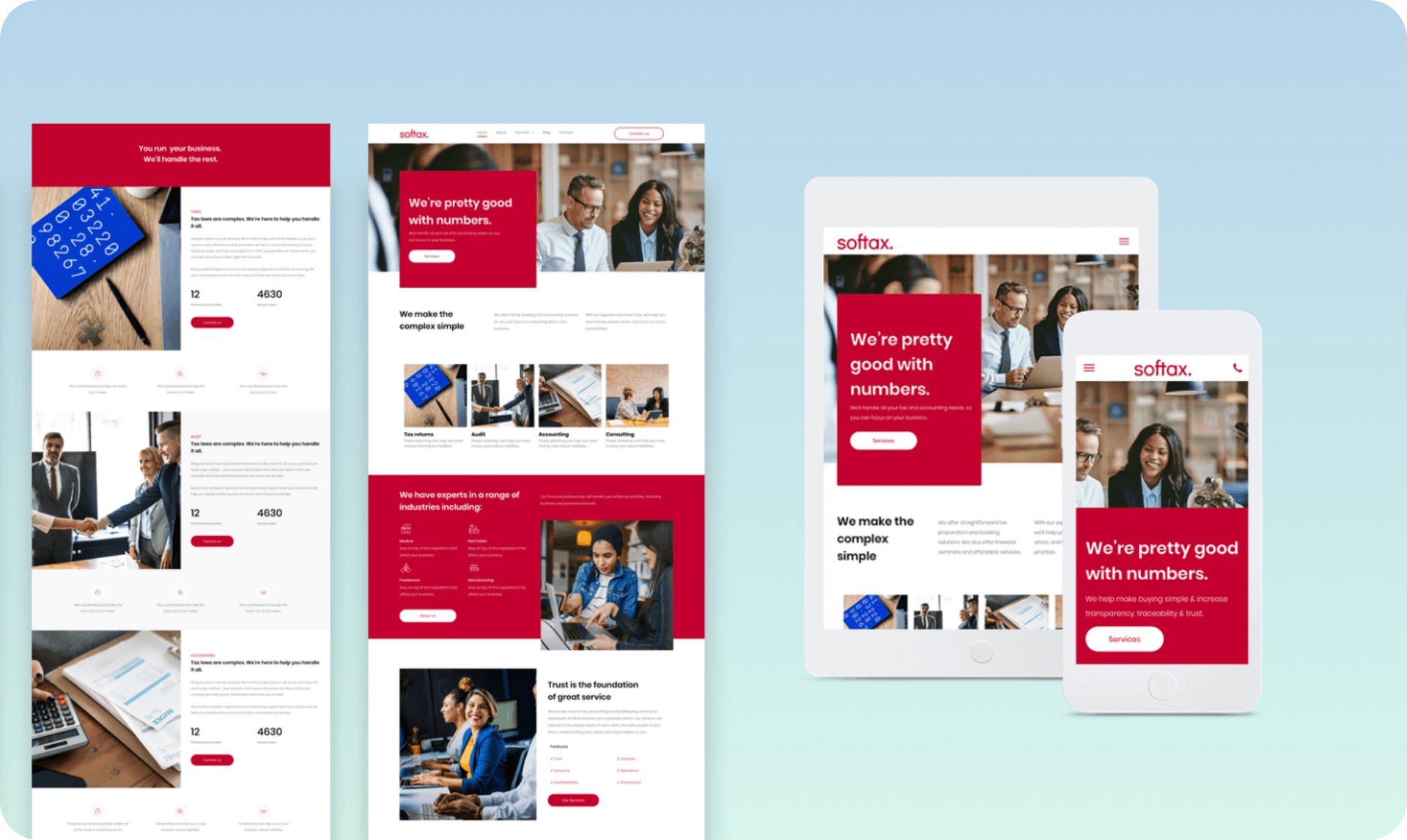
Reproducing the hero section - desktop & mobile versions
As always you can save any part of this template as a Section and then use it over again in other websites, but if you want to recreate this section elsewhere on your own, you can simply follow these steps.
Desktop version
1. First, add a row. Add a background image; set the top padding to 120px and the left and right padding to 40px.
2. Add 2 columns to the row. In the left column, set the background color to red. Round the corners to 5px. Set the top and bottom padding to 100px; set the right and left padding to 40px. Set the bottom margin to -70px (so it overlaps with the row below.)
3. Add a title, paragraph and button widget to this column. In the right column, add a spacer widget and leave it empty.
Mobile version
Go to the mobile view and follow these instructions:
1. Right-click on the row and toggle on Reverse Column so the empty (right column) is on top of the red column. Set the row spacing to 0 and set top padding to 50px.
2. In the top column, set the spacing to 0px and set the spacer widget to200 px. In the bottom column: Set the top and bottom spacing to 30px and the left and right spacing to 20px.