CREA SITIOS DE GRAN RENDIMIENTO
Creador de sitios web
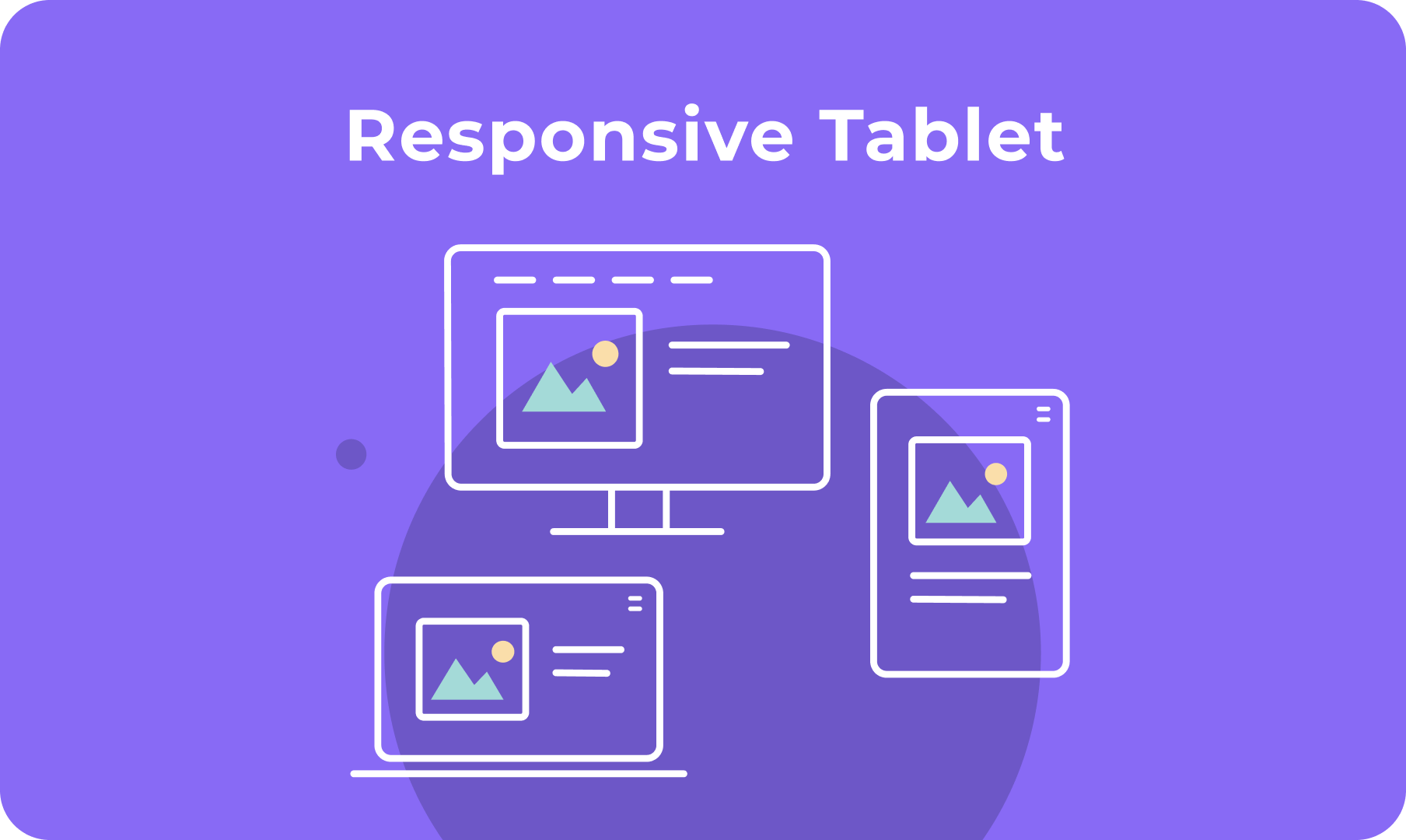
Crea sitios web atractivos a gran escala
LOS ELEMENTOS ESENCIALES INCLUIDOS
Pila de IA
Aumenta tu eficiencia con herramientas de IA integradas
SEO
Crea sitios mejor posicionados
Comercio Electrónico
Vende cualquier cosa, en cualquier lugar
Reservas
Embed powerful scheduling capabilities
ACELERA EL CRECIMIENTO
Plataforma de marca blanca
Haz tuya la experiencia de tus clientes
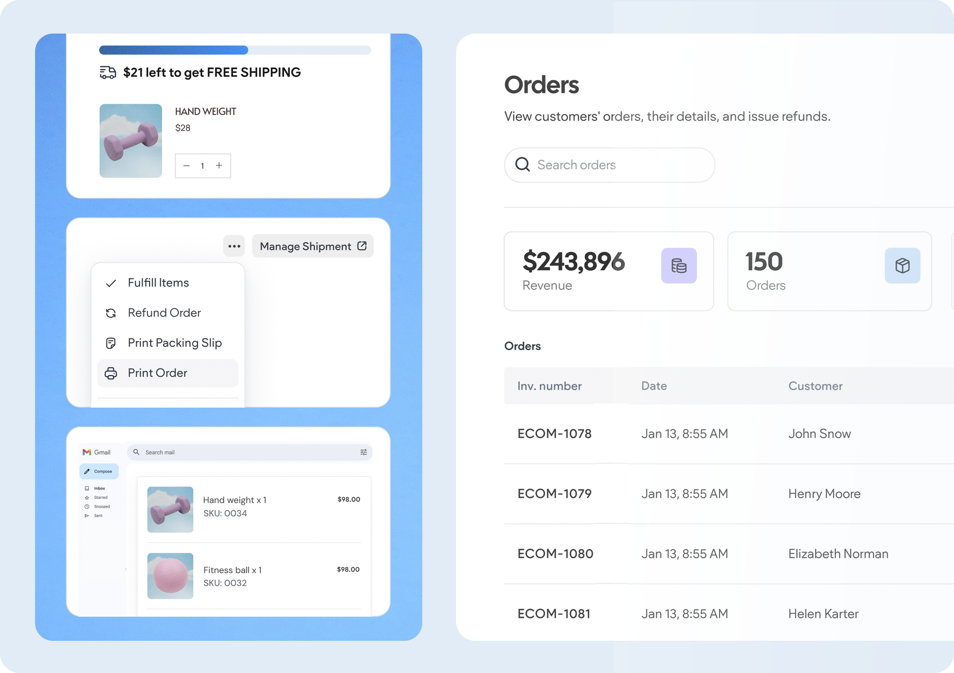
Gestión de Clientes
Gestiona tus proyectos en un solo lugar
Colaboración
Invita al personal y a los clientes a trabajar juntos
Facturación a clientes
Gestiona los pagos de tus clientes sin complicaciones
Automatización
Descubre la eficiencia con automatizaciones inteligentes

