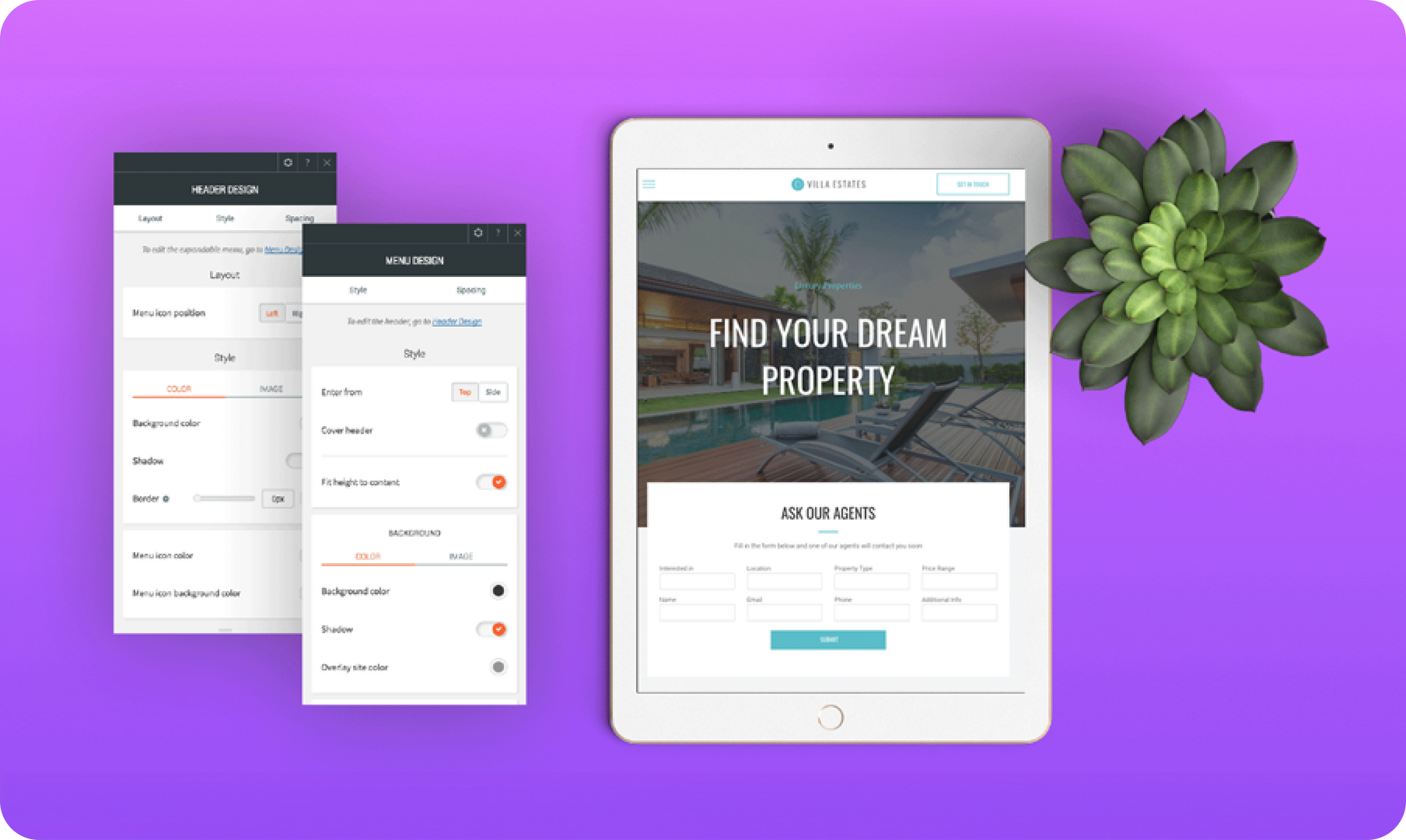
Looking for more flexibility in your tablet site layouts? Want to add widgets, control the menu icon color, and more?


You got it!


You now have more editing possibilities in your tablet site layouts. You can add any widgets that you want to the header and expandable menu, choose whether the sidebar enters from the left or right side of the screen, decide what effect the sidebar has when it appears on the site (for example, whether it pushes the page content aside or covers it), and more.


With this new flexibility, you’ll be able to boost tablet site conversions by adding important icons and messages to the header or expandable menu. You’ll also have more design possibilities.


Here's how to get it


To get the new tablet layout in your website, simply open the tablet header Context Menu, click Edit Design, and click Update header. If you don’t see the Upgrade header message, go to Site Layout and choose the rightmost tablet layout.


Note: When you switch your site layout, an automatic backup is made. To access this backup, open the site Settings and click Backup Site.


In addition to updating your tablet header, your mobile and desktop headers have also been updated. See Fantastic Mobile Header & Expandable Menu and New Sidebar Layout for Desktop Sites for all the details.


December 30, 2017
Roni Landau

 • 

New Tablet Layout

Latest product updates

Website interface displaying a grid of blog post previews with canyon imagery and text snippets.
By Ofri Baram September 11, 2025
Big blog news coming your way...
Three website interface views showcasing a button, input field, and dropdown menus.
By Annat Katz September 2, 2025
Currency formatting, text links turn into buttons when dragged to the canvas from an uploaded file, and more.
Brown handbag isolated on transparent background with pinkish backdrop, replacing the background.
By Liron Hilb Horev August 22, 2025
Small action, big impact, and lots of happy professionals who have been waiting for this.