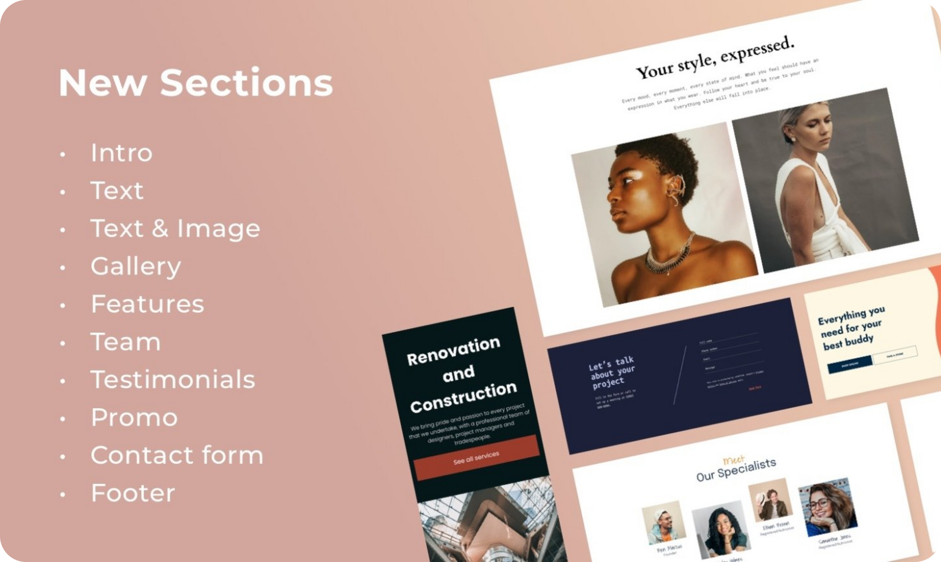
BUILD & CREATE
Website builder
Create beautiful websites at scale
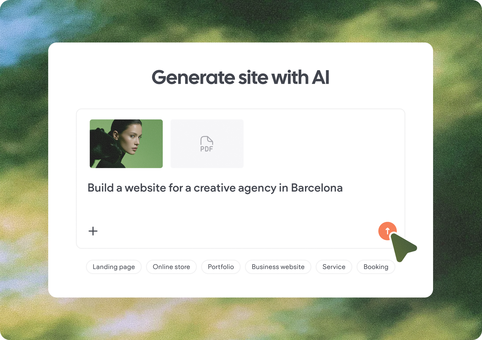
AI Stack
Boost your efficiency with built-in AI
tools
AI Widget Builder
Create custom widgets with AI
DISCOVERABILITY
Duda AEO
Win visibility in AI-powered search
SEO
Build sites that rank higher