A lot goes into building a great website for your clients. In addition to having the site look great and load quickly, the site also needs to be READABLE. Because even if you build the world’s fastest, slickest, most beautiful website, if the text is unclear, incorrect, unnecessarily complicated or badly written, it just isn’t... (more...)
The post Writing Right: 19 Tips for Keeping Your Site Copy Clean, Cool and Converting appeared first on Duda Blog.
Whether someone on your team is writing the text for your sites or your clients are writing the content themselves, it never hurts to remind yourself how to write great website copy.
So, here are 19 tips (in no particular order) for keeping your site copy cool, clean and converting.
1. Write H1 texts that count
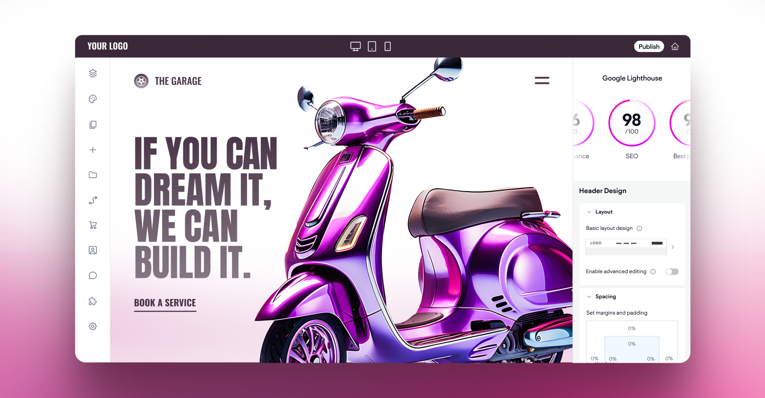
The H1 text on your website is very important. Not only is it the first text that visitors see when they reach your site, but it’s also the text that Google sees when it reads your site for SEO.
From a design perspective, text in the H1 tag is much larger than the rest of the text on the page, and it’s your job to make it meaningful, too. Make sure the text contains words that relate directly to the content of the site and make it crystal clear what the site is all about.
2. Pay attention to micro-copy, those short texts that say so much
Micro-copy is the short (usually) text that guides users through your site. Micro-copy prompts users to take certain actions. For example, the text on buttons, read more links, and contact form fields are all examples of micro-copy.
When writing micro-copy, being clear is very important, because if users don’t know what you want them to do, they are going to be confused. Some sites try to be cool instead of informative, but we recommend you stick with text that says exactly what the site visitor needs to know.
3. Be specific when possible
In the old days of the internet, it seems every other button read either “Start Now” or “Go Now”. Though these buttons can still be handy sometimes if you can offer visitors a more specific command, go for it. Say what you mean and don’t be afraid to use verbs. For example:
- Read more
- Watch now
- Learn more
- Watch video
- Contact us
If you can let the user know what to expect, go for it.
4. Keep paragraphs short and concise
We recommend keeping texts short on your website, even when it comes to paragraphs. For example, if you’re explaining a service, describing a product, or writing about company history, you’re going to want to write a few sentences. In all of these cases, we recommend writing relatively short paragraphs, with relatively short sentences. If you have multiple paragraphs, use white space to break up the text so it is easier to read.
5.
Add text in the image settings, too
Support the great images on your website
s with clear descriptive text (as image attributes, not on the screen) so that the images are ‘visible’ to Google. This is important for SEO
and enables screen readers to read the content of the images for visually impaired visitors.
6. Choose fonts wisely
Fonts have a huge impact on how people understand written texts. Fancy fonts make texts seem more complex. Simple fonts make texts more readable. Use bold fonts for headings and they’ll be more readable.
7. Capitalization matters
While some rules are meant to be broken, that doesn’t apply to the rules of capitalization. Do readers a favor. Follow the rules of capitalization on your site. It makes everything easier to understand
.
8. Put a positive spin on your 404 pages
No one wants a site visitor to reach a 404 page, but it happens. While you may not be interested in creating a supercool 404 page for your customers, that doesn’t mean you can’t
optimize this space
with clever text that will redirect visitors to the right place on the site.
9. Make the most of placeholder texts
If you’ve got any type of contact form on your site, you’ve got placeholders. These are the empty fields where visitors are asked to add their email address, phone number, etc.
Don’t leave these fields empty, as visitors may not know quite what to write. Instead, use text that guides visitors (such as a mock email address or phone number). Visitors can use this text as a guide, so they fill in the form properly on their first try.
10. Write bios that are relatable & relevant
Many websites have a page dedicated to the company team. Large companies may have detailed descriptions of partners and founders only; smaller companies may have descriptions of everyone at the company.
Regardless of who you’re describing, keep the descriptions relatively short and relevant. Try to make the bios consistent too – it’s odd for one person to have a 4-paragraph bio and another person to have just two lines. Make the bios engaging and aligned with the look and feel of the site.
11. Write for the site’s audience
Not all audiences are the same, and site content should reflect this. Consider who the audience is and write for that audience. In other words, the language used in a real estate website would be different than that used for a surf shop.
12. Correct grammar is right for every audience
You can definitely write in different styles and tones for different audiences, but every audience deserves correct grammar. It may be cool, trendy, sophisticated, hip, elegant, for any age and population, but spelling and grammar should always be correct. If you’re not sure if something is correct (or if you’re not writing in your native language) find an editor or writer who can make sure everything is correct.
13. Don’t mess with eCommerce Text
While there are some areas of site content that you can certainly play with (bios, menu items, product names, etc.) when guiding site visitors to make a purchase, keep things as clear as possible. That means straightforward commands that clearly indicate what’s going to happen next.
Buy Now, Add to Cart and Go to Checkout are crystal clear instructions that should be kept that way.
14. Just the basics, please
If your customer has a contact form on their website, make sure every field in it brings valuable information. In other words, don’t ask visitors for information that your customer doesn’t need. Fax number? Favorite color? Probably not.
Including unnecessary fields waste site visitors’ time, but may turn them off from completing the form.
15. Use humor…with caution
Humor can be a great conversion tool, but there’s a fine line between humor and everything else. If there’s a chance that site visitors may find something offensive, rude or inappropriate, just leave it out.
16. Write for lazy readers
People visiting your website want information – they don’t want to read Dickens. So write simply, clearly, in short sentence and with short words. Your site isn’t a university entrance exam, so keep the language as simple as possible.
17. Take advantage of additional site pages
In some cases, may want to write more than a paragraph or two about a certain subject. For example, in describing a product or service. In such cases, instead of placing multiple paragraphs about a specific issue on a single page, considering a “Read more” button that links to another page that’s dedicated to that topic.
18. Jargon, be gone!
You may well use jargon in your office and when talking with colleagues, but we highly recommend keeping it off websites. You don’t know who’ll be reading your website, and there’s a good chance they may not be 100% familiar with your industry jargon. (This is particularly true for new customers…).
So keep the jargon to a minimum and keep the text readily and understandable.
19. Edit. Now edit again.
Don’t be satisfied with the first draft of anything. There is always room for improvement. So after you’ve written the first draft of your website, take a break and go for a walk in the forest.
When you come back to the text, be prepared to edit, revise and rewrite. Replace big words with smaller ones. Remove repetitive sentences and ideas. Make everything shorter.
That’s all there is to it
Of course, writing great content requires practice. The more you write, and the more you read about writing, the better your site copy will be.
Have tips to share with us about writing? Let us know in the comments below.


