Design Editor
General Inputs
The Design Editor has many inputs that are available in the Content Editor. Each of these inputs are listed below with a link to the documentation found under the Content Editor.
Background
Gives the user the option to set the background color or background image.
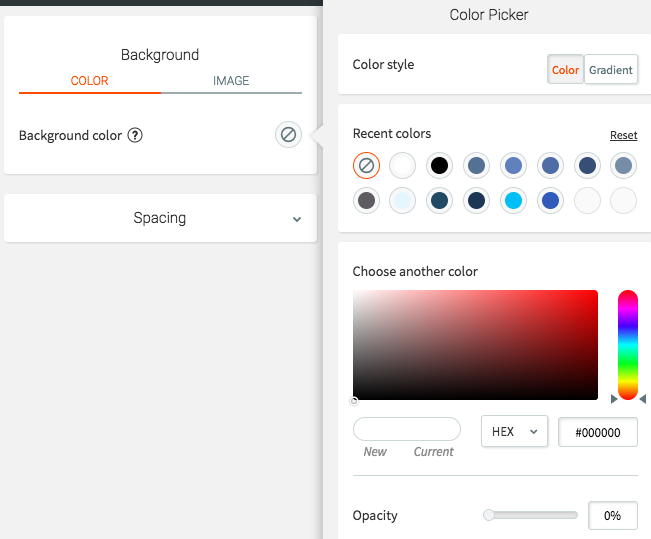
Border
Gives the user direct access to the border color and sizing of an element.
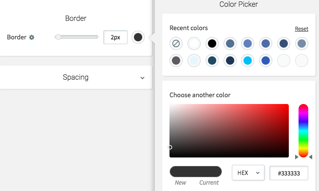
Button
Button should match with the custom_button handlebars helper. This gives the user full design control over the button, such as background color, text color, sizing, hover options, and so on.
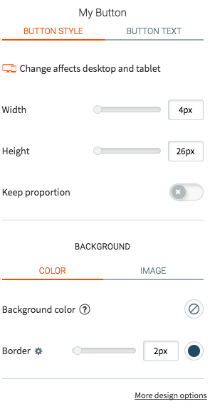
Color Picker
The most basic color input. This input type allows you to set both the CSS property (such as border-color, color, and so on) and allows the user to select the color value. This color picker can output as widget styled CSS or as a variable into Handlebars/JavaScript (in Hex format).
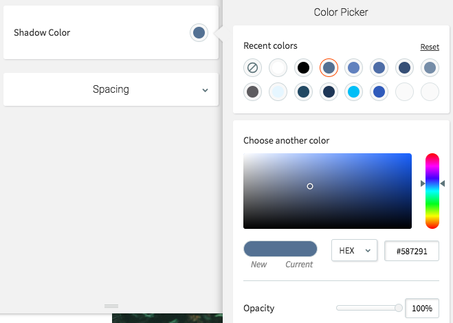
CSS Slider
Allows a user to select a size or any numerical input as a slider. You can set multiple CSS properties (such as padding, margin, height, border-radius, and so on). You can have Duda output an absolute pixel value or a percentage. An optional maximum or minimum value can be set.

Dimensions
Controls the width and height of an element. Note that width and height apply to desktop/tablet and mobile differently.
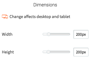
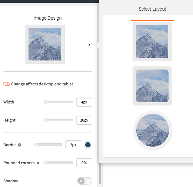
Image Design
Controls design properties of an image like (dimensions, layout, border, rounded corners, shadow, and so on).
Layout Selector
The layout selector allows for multiple design options for a custom widget.
A default layout setting cannot be set in the widget builder. The logic below uses the else clause for the first layout option,
layout_1. When widgets are first dragged to a page they are always assigned the first layout option.
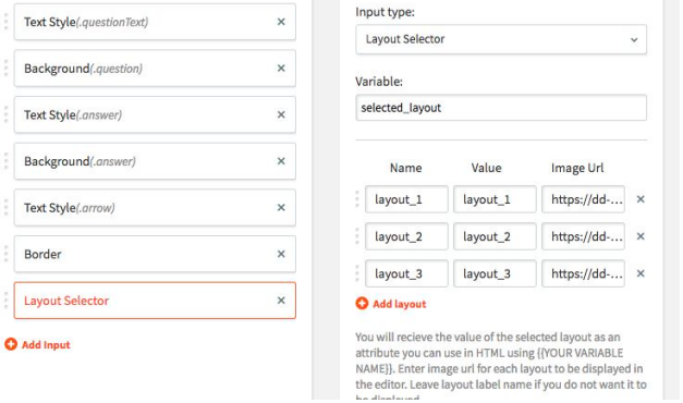
The example above has a variable name of selected_layout. This variable is made available automatically in the HTML via handlebars (for example, {{selected_layout}}). The above example has 3 different layout options the user can choose from: layout_1, layout_2 and layout_3.
In the widget’s HTML file different HTML markup will be displayed on the screen based on the selected layout. Here is an example of how to do this.
{{#equals selected_layout "layout_2"}}
	<div class="mywidget layout_2"></div>
{{else}} {{#equals selected_layout "layout_3"}}
	<div class="mywidget layout_3"></div>
{{else}}
	<div class="mywidget layout_1"></div>
{{/equals}}{{/equals}}
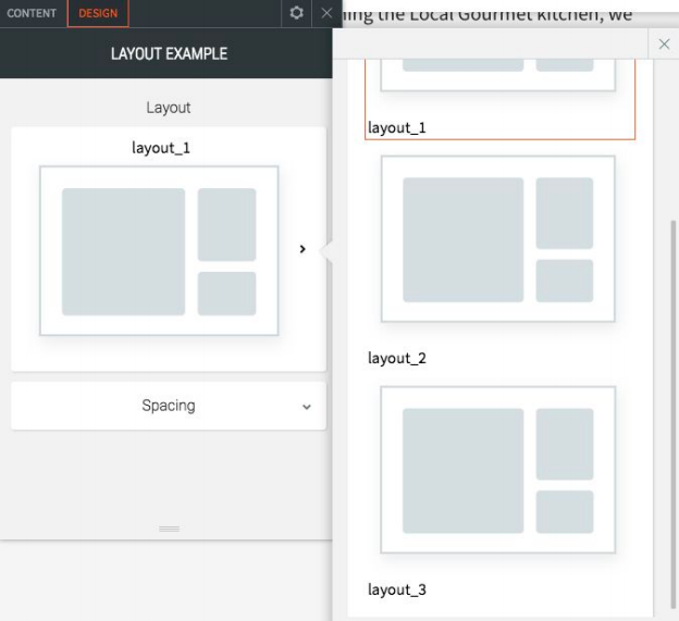
In the Duda editor, the widget displays each layout selection as shown below. The images displayed for each option can be set in the widget builder. Please use an SVG for the best experience in the editor. The example below uses the same SVG image for each layout. More than likely your widget will use different images for each.
Rounded Corners
Allows a user to control the rounded corners for a given element. You can have Duda output an absolute pixel value or a percentage. An optional maximum or minimum value can be set.

Text Style
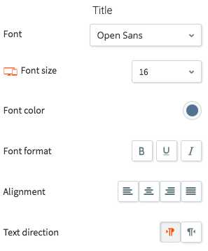
Gives full text style control over text. Allows users to change the font, text color, font weight, alignment, and more.
Element Resizing
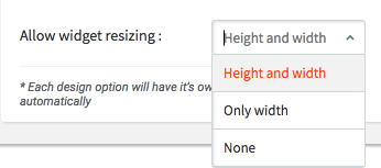
Duda allows you to control in which ways the user can resize a widget. By default, users can use a blue drag handle to give elements an absolute width and height. If your widget is dynamic in anyway, such as expanding/collapsing, then this can be problematic. At the bottom of the design inputs, you can find an option to control which options a user will have.
| Option | Description |
|---|---|
| Height and width | Allow the user to define the height and width of the element. In general, use this for more basic elements. |
| Only width | Allow the user to only set the width of the widget. If your widget changes in height dynamically, you'll want to use this. For example, if you are using the FAQ widget, you want to allow users to control the width, but not the height, as the height can change based on the open item, number of items, and so on. |
| None | Do not allow the user to resize the widget at all. |
Updated over 2 years ago