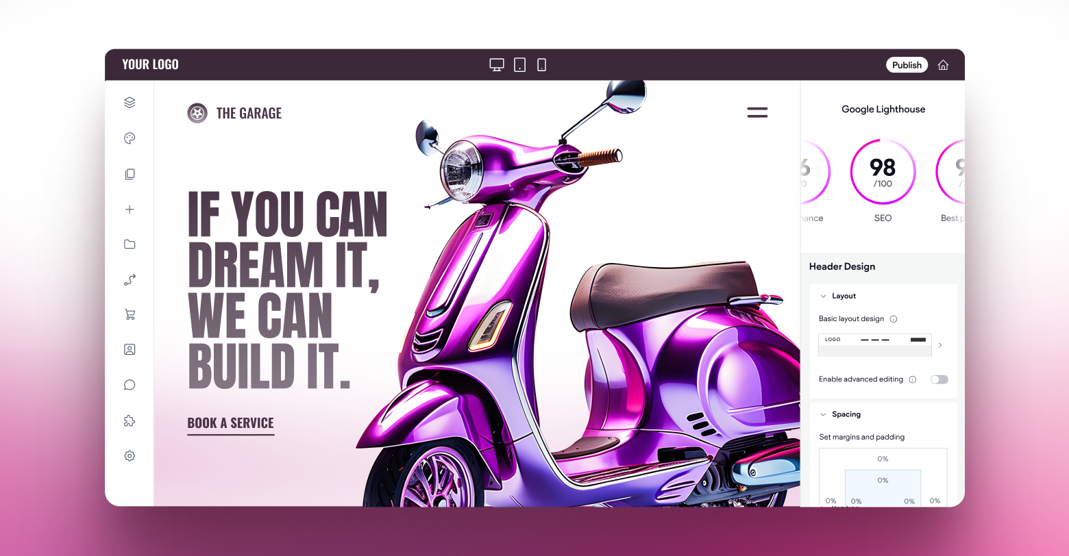
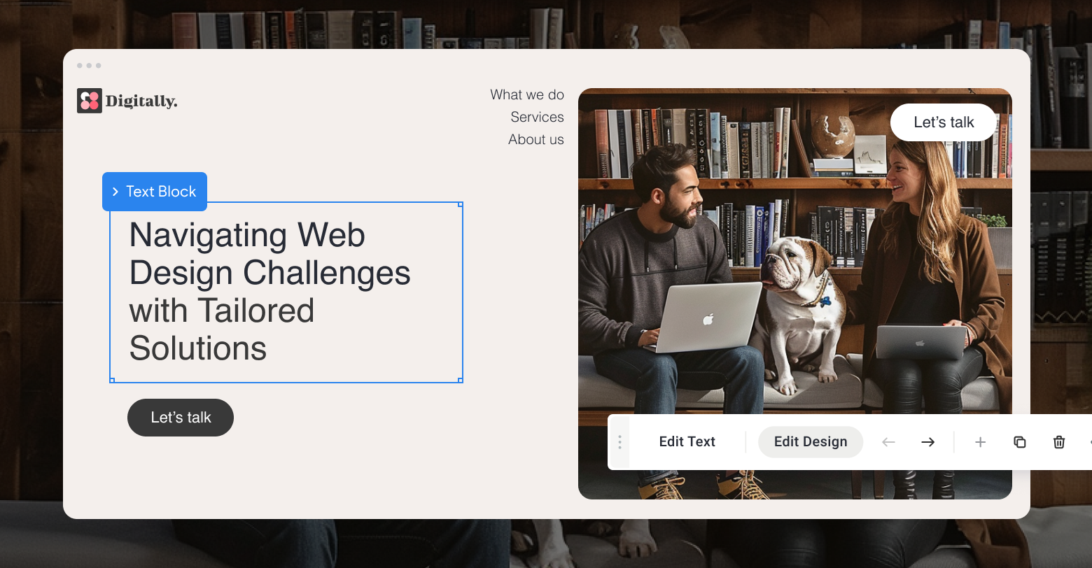
A website header is the first thing that visitors see when they visit a site, and it appears on every page of the site. A good website header balances clean design and crystal-clear navigation to the deeper pages of a website.
As such, it’s important to concentrate on best practices to design a website header for your clients that helps their customers quickly get to the information they need.
To help you build great headers for your sites, here are 11 tips to guide you. Also, make sure you select the right
website builder for your agency -- one that will allow you to create the right header for each of your clients.
FIRSTLY, WHAT IS A WEBSITE HEADER?
For those completely new to website design, as we’ve mentioned a website header is the first thing you see on a page and is a strip of content that is often pinned to the top of a site to ensure consistency across it.
Ultimately, a header is something that sets the tone and feel of a website and ensures that the branding is always on point and that people know exactly what your brand is, what you do and what you stand for. That’s why it is so important, and why there are certain methods and tactics you must implement.
Tip #1. Emphasize the most important elements
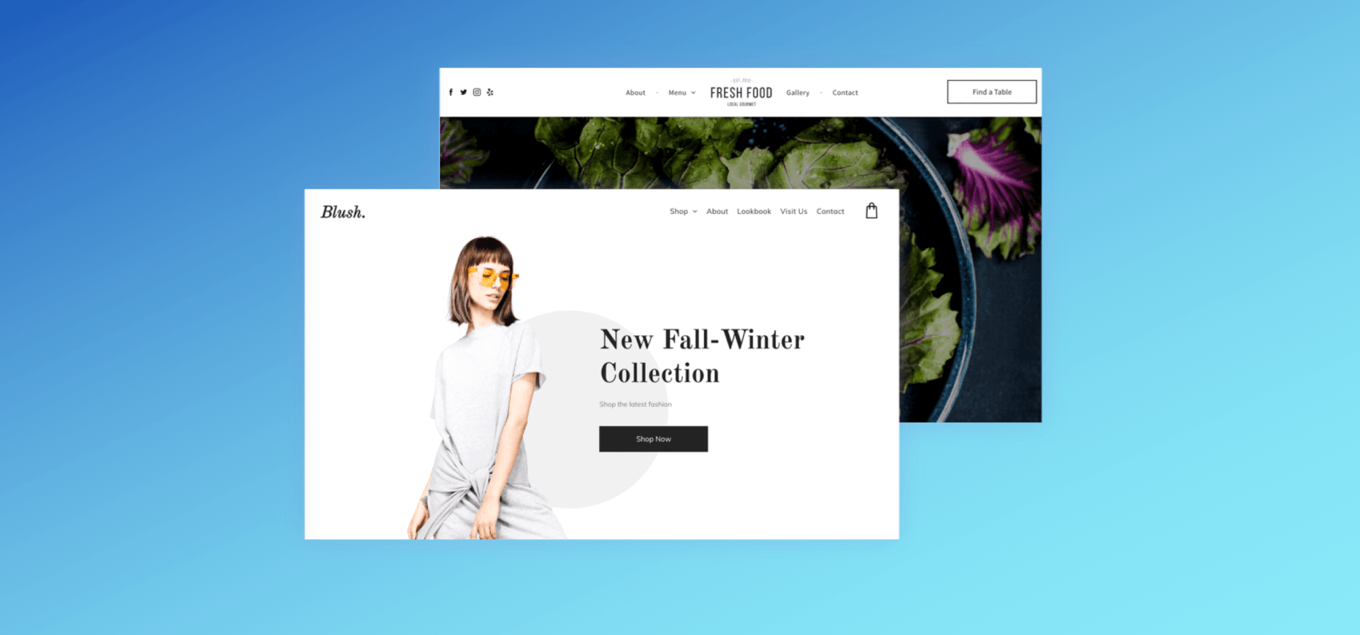
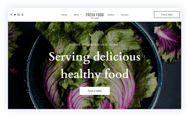
Consider the main thing that you want site visitors to do on a site, and make sure that this element is clearly visible in the header. For example, for nonprofit sites, have a Donate Now icon; for restaurant sites, have a Book a Table icon.
In general, headers contain information that makes it easier for visitors to interact with the site, including:
Navigation links
Company logo
Call to action (Book a Table, Donate, Call Us)
Contact information
Social media icons
Tagline
Multi-language toggle
Shopping cart
Navigation links: This allows for users to move around your website completely at ease, as well as always having a base to go back to in order to do such movement.
Company logo: This will reinforce your brand at all-times. It is crucial to have your logo on the header.
Call to action (Book a Table, Donate, Call Us): This will ultimately encourage browsers to use you and increase conversions on your site.
Contact information: Users won’t have to go searching around the site to get in touch. Again this will improve conversions and overall customer service.
Social media icons: By offering easy access to social channels you’ll increase your follower count and engagement across them.
Tagline: Here you can reinforce your brand values.
Multi-language toggle: Improve user experience by allowing users to switch languages seamlessly.
Shopping cart: This will simplify the process of reaching the checkout, and thus improve conversions and welcome more transactions on your site.
Consider which of these are most important for your sites, and emphasize them.
Tip #2. Use clear, readable fonts in your website header
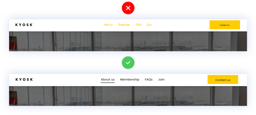
Text in a header must be readable at a glance. Use words that are short, when possible, and choose fonts that are clear and in a relatively large font size. Headers are not usually the place for stylized fonts, as these can be harder to read.
Tip #3. Use transparent headers for sites with impressive images
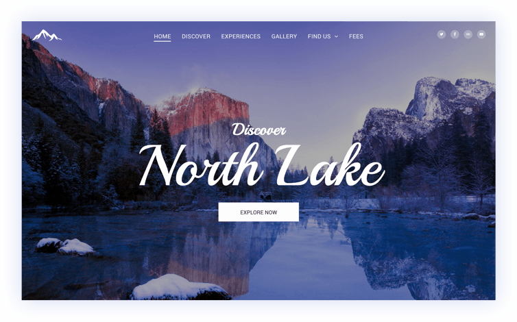
For sites that have dazzling images, try using a transparent header. This gives maximum exposure for images, while still showing important links.
If you’ve used a sticky header, having it transparent on scroll can be a bit distracting, because as the images move, the header background will move too. To overcome this, add a color to the background, so that scrolling images don’t distract users from the links.
Tip #4. Shrink the website header on scroll to keep key info visible
The shrinking header is a great way of minimizing the amount of space headers take when users scroll while keeping key site information accessible. They are particularly handy if you’ve designed a really big, impactful header. The shrinking header can show primary navigation elements and the logo, and change color as users scroll.
Tip #5. Got a shop? Put it at the top!
In
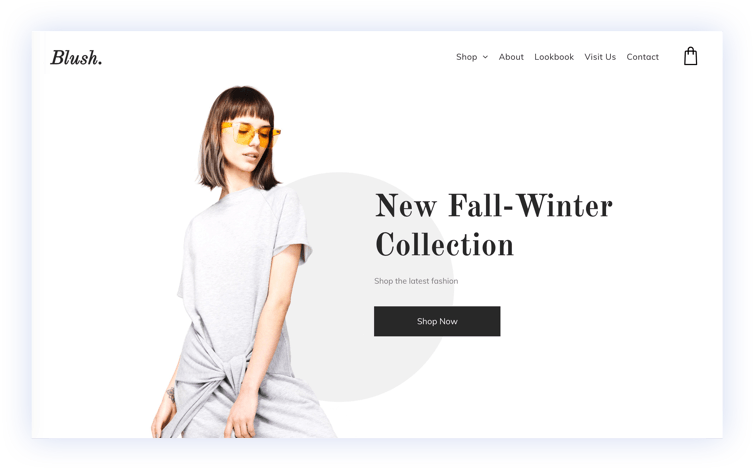
eCommerce sites, place a shopping cart icon in the header. This enables site visitors to complete their purchase easily and in a single click, regardless of where they’ve gone on the site. You will decrease the number of abandoned carts by doing this as users will always just be that one step away from the purchase. A good addition is to add a hover function to the cart so users can also see what’s in their basket without clicking through.
Tip #6. Use effects to show visitors where they are, and where they are going
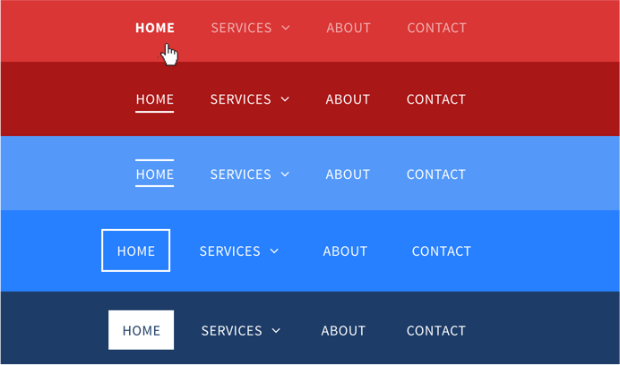
Hover/selected effects are important elements in guiding users as they navigate. Choose effects that are visible enough to attract attention, but not so visible that they distract. Note that some effects are only visible on desktop, so be sure to choose effects (such as a color change or underline) that will be visible on mobile devices.
Hover / selected effects show users where they are in a site.
Tip #7. Choose a site header layout that flatters the logo
Headers are often the first thing site visitors see, so having the company logo is important. When
building a new website, choose a header layout that best suits the logo shape and style. In general, round and square logos look best
in the center; rectangular ones look good to the right or left side.
Tip #8. Use design elements that express the company’s personality
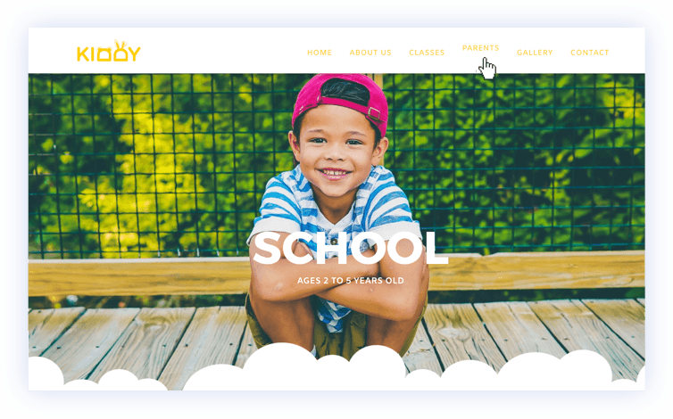
You can use colors and effects to express a company’s personality. For example, if a brand is light-hearted, having a floating effect when visitors hover the navigation can support this feeling. By contrast, a floating effect may be less appropriate for clients that offer professional services, such as lawyers and real estate agents.
Tip #9. Use expandable menus to let images shine
Expandable menus are terrific for image-rich websites such as portfolios as they allow plenty of space for images to shine. Many businesses when
building mobile websites have implemented them, and they are
increasingly growing on desktop ones, too.
For headers with important icons and links (for example, eCommerce sites), using an expandable header enables you to show a shopping cart icon that really stands out while indicating to visitors that additional information (for example, site navigation) can be revealed in a click.
Tip #10. Consider the sidebar – is it right for your site?
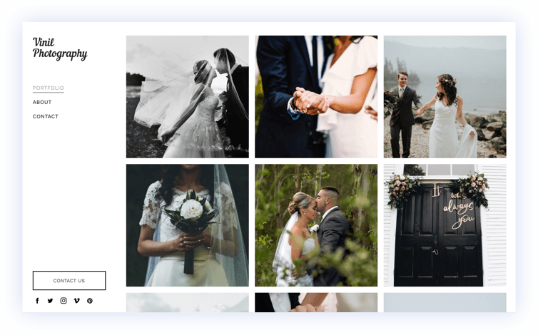
Sidebar headers enable you to keep key information on the site, while users scroll and with minimal distraction. They can be handy for sites with important anchor links, as those links will appear along the side at all times.
Tip #11. Change them up to keep your websites fresh
Headers are incredibly flexible, and have a huge impact on how your sites appear. That’s why changing website header layouts is a great way of keeping websites looking fresh, with minimal effort.
You don’t need to
choose a new template or alter the entire layout. Just change the header layout, make sure it looks great on all devices, and you’ve given your site a facelift, with minimal effort.
Related Posts
By Renana Dar
•
22 Apr, 2024
We sat out to redesign Duda's homepage using the most advanced capabilities of our own platform. See how we combined design, code, and advanced drag-and-drop capabilities to create a homepage like no other.
By Renana Dar
•
12 Apr, 2024
This article highlights web design agencies' unique challenges and provides a comprehensive look at how Duda is empowering these agencies with a complete toolkit for navigating the digital world's uncertain waters.
By Shawn Davis
•
21 Mar, 2024
Custom widgets empower your agency to create hyper-personalized, bespoke websites for clients—but only if you know how to code. Well, what if you didn’t have to?
Show More


